Parsons
A dedicated mobile app that allows bakery customers to place orders in advance and arrange a time for collection.
Platforms
IOS/Andriod
Disciplines
User Research - Usability testing - Wireframing -Prototyping - Product Design
Mobile App Design
The Product
Tap, scroll, tap…
Yum!
Parsons is an award-winning artisan bakery based in Bristol, UK, known for crafting high-quality, homemade food and beverages.
Serving a diverse range of customers across multiple locations throughout the South West, they offer a local alternative to high street chains.
To enhance convenience, I am developing a user-friendly ordering app that allows customers to place and collect orders seamlessly, bypassing in-store queues and saving valuable time. The app will feature intuitive navigation and a streamlined, efficient user flow for a hassle-free experience.
The Problem
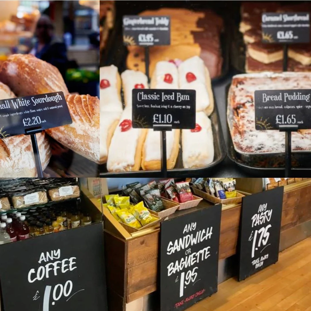
Imagine walking into a bustling Parsons bakery, only to find yourself surrounded by the aroma of fresh bread—but also by the chaos of a crowded store. The tight space makes it difficult to see what’s available, and the lack of structure turns ordering into a time-consuming, frustrating task.
Politely queuing outside Parsons…
that fresh bread smell…
My goal is to develop a product that streamlines the entire experience—allowing customers to skip the hassle, simplify the ordering process, and access all the information they need with ease, making the whole process as smooth as possible.
but will there be any left?
So, how do I create a solution that lets customers bypass this chaotic scene altogether?
My Role
Having initiated this project, I developed the project plan, performed user research, designed the mobile app, and tested it with users.
Although I worked independently, user feedback guided my design decisions, making it feel like a collaborative effort.
Design Process
From the very beginning, I knew this app had to be more than just functional—it had to resonate with the people using it. To achieve that, I embraced a human-centered design thinking process, placing the user at the heart of every decision.
My journey started with listening closely to Parsons' customers, learning their needs, frustrations, and desires. At the same time, I explored local competitors to uncover opportunities for improvement. Armed with these insights, I continuously refined my designs, making adjustments based on real feedback. This iterative process allowed me to adapt quickly and stay agile, ensuring that every tweak brought the app closer to meeting user expectations.
Understanding The User
Having a quick chat allowed thier pasty’s to cool down
User Research Summary
Whilst I had my own thoughts and experiences with Parsons, I knew I needed to truly understand the people who would use my app.
To do this, I spent time in my local bakery, chatting with customers who were kind enough to share their thoughts and challenges.
These conversations were invaluable, offering real insights into their needs. In parallel, I conducted a competitive audit to explore the broader landscape and see if other local bakeries were offering similar services.
Using donuts as compensation, I enlisted friends to help test the click-and-collect services provided by Parsons' direct competitors.
These usability tests revealed important insights and, combined with the customer feedback, allowed me to create a fictional persona that embodied the key challenges and frustrations users faced. This persona became my guide throughout the design process, ensuring that the app truly addressed the pain points uncovered in my research.
Interviews
“I would like to try an app, it would definitely help with the chaos if more people did that. It would make the experience more organised and you wouldn’t be worried about not finding the thing you want. I think that would be good.” Parsons customer
As I dove into conversations with Parsons customers, several key insights emerged:
Long wait times during peak hours often caused frustration, leading some customers to leave without ordering.
Many were disappointed when their favourite items were sold out by the time they arrived.
They consistently praised the quality of the goods and appreciated the special offers available.
Queues extending outside the bakery blocked access, turning potential customers away before they could even enter.
Customers found it difficult to view the full range of products Parsons had to offer.
However, there was widespread desire for a loyalty scheme that would reward frequent customers and encourage repeat visits.
“I’ve turned around and left the bakery without buying anything a few times, just because its so busy”
Parsons customer
Competitive Analysis
The food ordering and delivery app market is no passing trend—it's a fixture of modern life. With advancements in technology making it effortless to order from home, on the go, or even at work, these apps have become a go-to solution for convenience. They offer a wide range of choices, exclusive deals, and, above all, a smart way to save time and energy. According to research from the Statista Research Department, the popularity of these platform-based services is only set to grow, with users projected to reach 28.62 million by 2028.
This growth is driven by three key factors: the convenience of accessing meals anytime, the speed of service, and the variety of choices that cater to every taste. Understanding these drivers is essential to positioning Parsons within this competitive landscape.
Under the hood
99 problems but my ordering app ‘aint one.
After digging into reviews on the app store, I was curious to explore how these apps were actually performing behind the scenes. I set out to hear firsthand from the employees of Parsons' high street competitors to understand how the apps were impacting their day-to-day operations and whether they were truly delivering the convenience they promised.
Greggs
“Click and collect works well, we have regular customers who use it frequently.” Rob, sales assistant
Coffee#1
“We have a regular who uses click and collect every day.” Katy, sales assistant
Cafe Nero
“I don’t like having a big queue in here so we try to work as fast as possible to get through it. App orders are great for that, it's a better experience for those sitting in to not have people standing all around them.”
Nick, store manager
Finding out for oursleves
Now came the moment to put these apps to the test in real time. I had my participants comparing features and completing the journey from order to collection. As I observed and walked through the screens with them, I gathered valuable insights into what they liked and where they faced frustrations. Their feedback highlighted key areas for improvement, offering clear direction to make my app more intuitive and seamless than the competition.
My research revealed that users of competitor click and collect services often felt frustrated and uncertain.
Our order was waiting for collection… we received the email and text alerts some 3 hours later!
Pain Points
Participants expressed a desire to choose a collection time that fit their schedule.
They also wanted the flexibility to cancel an order if needed.
Finding specific items was often frustrating, as they struggled to locate them quickly.
A lack of secondary confirmation left users feeling uncertain about their order status.
Lastly, they felt restricted by the app’s rigid navigation and wished for more freedom to explore.
Business Opportunities
Incentivised app download at Coffee #1
Through my research, it became clear that a mobile app could also unlock significant opportunities for Parsons:
A mobile app would allow the bakery to offer a personalised experience through customised orders and recommendations.
Streamlining the ordering process would reduce in-store congestion and alleviate employee stress.
Introducing a loyalty program would encourage repeat customers and reward engagement.
Order tracking and incentive monitoring would provide valuable customer insights for refining offers and increasing value.
Product Design
I based the product design on a fictional persona, Julie, using her story to guide my storyboarding and wireframes. Julie is a cool customer and her needs and frustrations shaped each feature, ensuring a seamless and user-focused experience throughout the design process.
Julie is a paramedic with limited free time.
She wants to be able to order her breakfast items for collection so that she can save time on her morning commute.
Julies Story
Storyboarding what Julies morning commute might look like with the app in her life
Wireframes
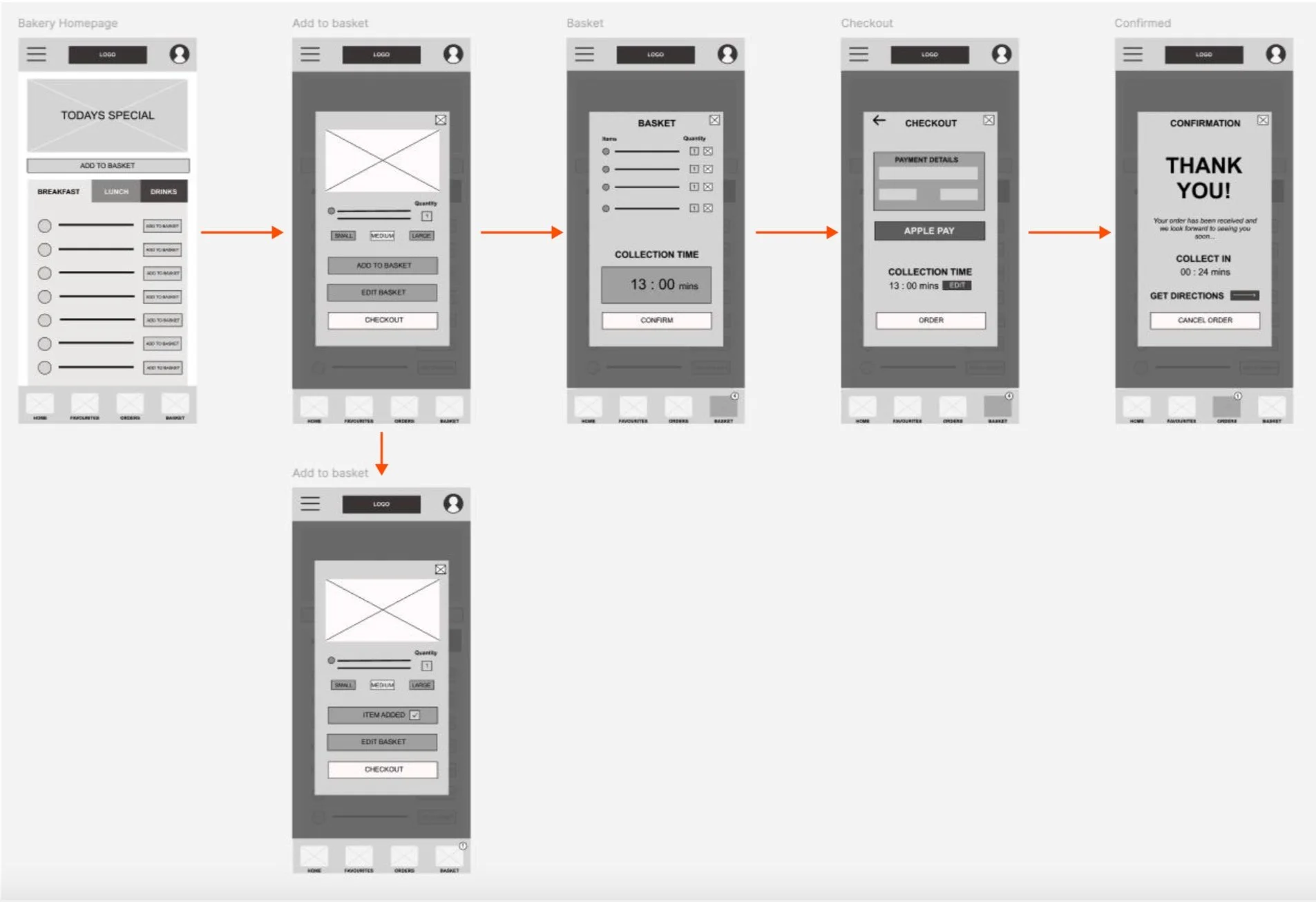
While sketching paper wireframes for each app screen, I focused on addressing user pain points related to navigation, browsing, and the checkout flow.
The home screen wireframe variations above are designed to streamline item discovery and quick addition, optimising the user experience.
This digital wireframe of the app homepage demonstrates how the menu structure enables users to navigate, find, and add items quickly and efficiently.
The order confirmation page details how my user is given clear direction and important information relating to their order.
Prototype
In building my prototype, I focused on creating a user journey that guided users from the homepage to order confirmation. This prototype was designed to reflect Julie’s experience, allowing seamless navigation through browsing, adding items to the cart, and proceeding to checkout.
By conducting a moderated usability test, I aimed to gather valuable feedback and insights that would refine the user experience even further, ensuring that the final product truly resonated with the needs and preferences of users like Julie.
Usability Study
To ensure the app met real user needs, five participants of varying ages navigated the prototype, providing insights into areas where the design could be improved. The main findings revealed three key areas for enhancement:
Users struggled to arrange a collection time easily, highlighting the need for a more intuitive interface.
Participants found it unclear how to cancel an order, signalling that better cues and clearer steps were required for this function.
Users expressed a desire for directions to guide them to their order collection point, suggesting that adding this feature would greatly enhance the overall experience.
These insights provided valuable guidance for refining the prototype, ensuring a smoother and more user-friendly journey.
Refining Designs
One of the most important takeaways was the need to simplify the process of selecting a collection time—a critical function that could also streamline the checkout experience. With this in mind, I decided that choosing a collection time should be the very first action a user takes. By placing this step at the beginning of the journey, the app would not only become more intuitive but also significantly reduce the friction during checkout. This adjustment was designed to set a smoother flow for users, helping them feel in control right from the start.
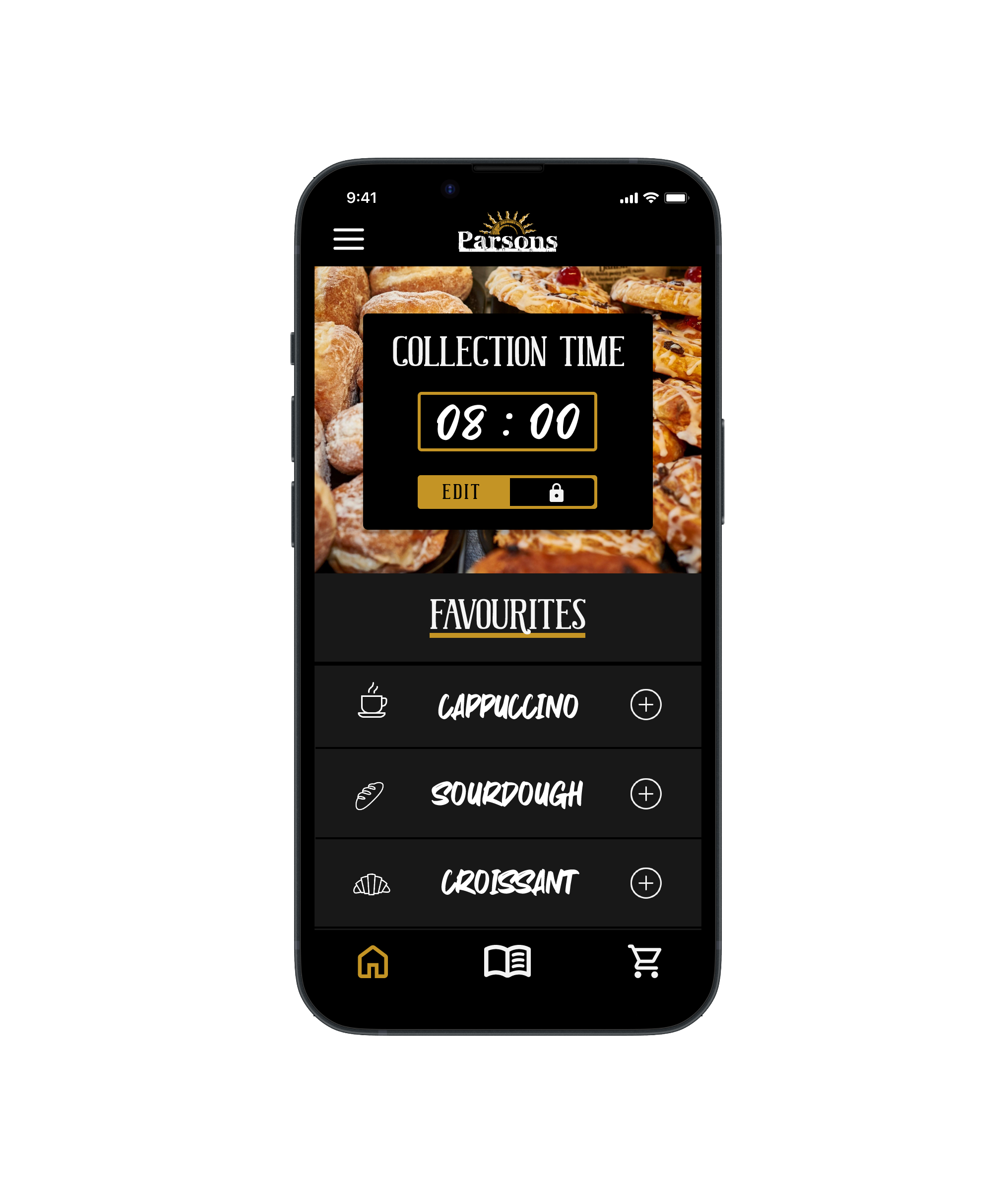
To address the issue of items being hard to find, I took a suggestion from a usability test participant and moved the favorites list to the home screen. This change allows users to quickly access and add their favorite items, streamlining the ordering process and making the app more efficient and user-friendly.
Collection Time
To further enhance the user experience, I wanted to give users more control by allowing them to view and edit their collection time at any point during their journey. This flexibility would empower users to make adjustments as needed, ensuring a smoother, more convenient process.
Before and after
The images above showcase my refined design, with this feature in action on the basket page below.
Here, users can easily review and modify their collection time before completing their order, making the entire process feel more adaptable and user-friendly.
Visual Design
As I moved into the visual design phase, I aimed to stay true to Parsons’ established branding while prioritising accessibility and usability.
My goal was to create an app that felt like a natural extension of the bakery’s personality, from its colours to its typography.
Drawing inspiration from Parsons’ website and store interiors, I crafted a design style that would not only reflected the brand but also give users a sense of connection to the bakery, even through the app.
Accessibility
I initially incorporated this call-to-action button design from Parsons website into the app, however the WebAIM Accessibility testing service showed that the contrast failed accessibility.
To address this, I revised the design, enhancing the contrast for usability while preserving brand consistency.
Outcomes
After refining the app based on my initial rounds of testing, I recognise that there’s still room for improvement. Early feedback on the time selection tool has highlighted some usability challenges, indicating that further adjustments are needed to enhance its functionality and make it more intuitive.
On a positive note, I’ve received encouraging feedback about the overall user journey, which was one of my key objectives from the start. Knowing that users are finding the navigation smooth and the experience satisfying is a rewarding outcome, but I remain committed to refining the app further.
Development
Although this project is very much in its infancy, I have reached out to Parsons in order to find out if this might be something they would consider developing. While awaiting their response, I intend to continue testing in order to identify additional areas for improvement.
Building on suggestions from testers, I’m eager to develop new designs for additional screens in the future, including:
Onboarding and account set-up
Store selection
Meal Deals
Loyalty card scheme
As I move forward, I will continue updating this case study and refining the app. I’m excited to see where this journey leads and how the app evolves to better serve both the users and Parsons business.


